Login using guest / guest
SVG Graphics
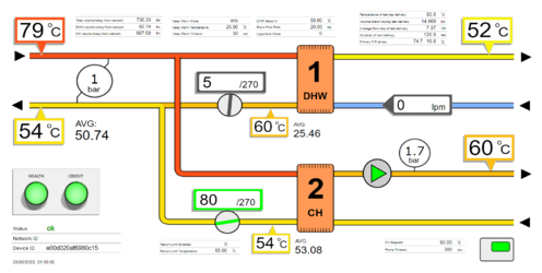
Above is a live dashboard shows a twin plate HIU fitted with open-source monitoring (watch it and figures will change in real-time).
This dashboard can be applied to any make of HIU where it is possible to extract data, either through wired connection or through the use of additional sensors.
This form of dashboard uses colours and text to give an 'at-a-glance' feeling for all temperatures and current operation. It includes sensor readings, settings read from the HIU, and daily statistics, while also providing access to graphs.
Multiple dashboards can be seen running side by side live on the Dual HIU dashboard example.
All graphics using in software is based on the SVG standard file format. This allows compatibility with all browsers, and allows individual elements to be manipulated through code.
Inkscape is a free software package available for all computer platforms that is used to create and edit SVG files. It is one of the most useful programs of all time, with the ability to open PDF documents and then save them as web SVG graphics. This way output from any software package can be printed to PDF, and then via Inkscape be converted to an SVG file and edited or manipulated.
Reactive MQTT Dashboards
Reactive dashboards are automatically generated from incoming MQTT data, creating individual active graphics elements that respond to new data in real-time.
This allows multiple SVG graphics to be combined into a single display based on a URL.
Graphs
Graphs are the other vital tool used in diagnostics, providing historical data that lets us understand events. The graph below shows central heating flow are return temperatures as well as room thermostat calls, from the system above with compensation. It allows us to analyse how the central heating is operating, and how often the room thermostat is calling. This is a live and interactive graph - you can zoom in, turn on/off lines, and export an image.
See Full Graph...
Currently we use Plotly.js for graphing.
Device Panels
There are numerous ways to present summaries of devices, each suited to different tasks.
One of the most useful is a compact traffic light summary of devices (HIUs) showing their status. This allows hundreds of devices to be viewed at a glance.
Shown below is an embedded device panel showing the live status of HIUs in the field.
Device panels can be customised to show the preferred system identification, which would normally be the plot number or address.
Icons can be shown within elements to indicate current mode of operation, if a tap is running, or if heating is on. In this panel we are showing additional indicators regarding heat meters and HIU firmware.
Data Tables
The following table is an embedded MQTT Data Table. It is a web page that subscribes to MQTT data and shows incoming messages in a table format.
Data in the table is updated in real-time as it lands on the server. Right click on data to access historical graphs.
This type of report uses MQTT security to subscribe to data, and can be sent to someone as a stand-alone html file, that whenever opened will log onto the server and start displaying data.
Data Tables are a standard feature in the node-red-contrib-heatweb set of Node-RED nodes.
Upgrading Controls
     { "class": "GraphLinksModel",
      "copiesArrays": true,
      "copiesArrayObjects": true,
      "linkFromPortIdProperty": "fromPort",
      "linkToPortIdProperty": "toPort",
      "nodeDataArray": [
    {"key":1,"name":"Unit One","loc":"-25.574964750701383 196.3160717356572","leftArray":[{"portId":"left0","portColor":"#000000"},{"portId":"left1","portColor":"#00ff00"},{"portId":"left2","portColor":"#000000"},{"portId":"left3","portColor":"#00ff00"},{"portId":"left4","portColor":"#000000"},{"portId":"left5","portColor":"#00ff00"},{"portId":"left6","portColor":"#000000"},{"portId":"left7","portColor":"#00ff00"},{"portId":"left8","portColor":"#000000"},{"portId":"left9","portColor":"#ffff00"},{"portId":"left10","portColor":"#000000"},{"portId":"left11","portColor":"#ffff00"},{"portId":"left12","portColor":"#000000"},{"portId":"left13","portColor":"#ffff00"},{"portId":"left14","portColor":"#000000"},{"portId":"left15","portColor":"#ffff00"},{"portId":"left16","portColor":"#000000"},{"portId":"left17","portColor":"#00ff00"},{"portId":"left18","portColor":"#000000"},{"portId":"left19","portColor":"#00ff00"},{"portId":"left20","portColor":"#000000"},{"portId":"left21","portColor":"#00ff00"},{"portId":"left22","portColor":"#000000"},{"portId":"left23","portColor":"#00ff00"}],"topArray":[{"portColor":"#ff9800","portId":"top0"},{"portId":"top1","portColor":"#000000"},{"portId":"top2","portColor":"#ffcc00"},{"portId":"top3","portColor":"#000000"}],"bottomArray":[{"portColor":"#000000","portId":"bottom0"},{"portId":"bottom1","portColor":"#00ffff"},{"portId":"bottom2","portColor":"#000000"},{"portId":"bottom3","portColor":"#00ffff"},{"portId":"bottom4","portColor":"#000000"},{"portId":"bottom5","portColor":"#00ffff"},{"portId":"bottom6","portColor":"#000000"},{"portId":"bottom7","portColor":"#00ffff"},{"portId":"bottom8","portColor":"#000000"},{"portId":"bottom9","portColor":"#40aceb"},{"portId":"bottom10","portColor":"#000000"},{"portId":"bottom11","portColor":"#40aceb"},{"portId":"bottom12","portColor":"#000000"},{"portId":"bottom13","portColor":"#40aceb"},{"portId":"bottom14","portColor":"#000000"},{"portId":"bottom15","portColor":"#40aceb"},{"portId":"bottom16","portColor":"#bf6ae3"},{"portId":"bottom17","portColor":"#bf6ae3"},{"portId":"bottom18","portColor":"#bf6ae3"},{"portId":"bottom19","portColor":"#bf6ae3"},{"portId":"bottom20","portColor":"#bf6ae3"},{"portId":"bottom21","portColor":"#bf6ae3"}],"rightArray":[{"portColor":"#000000","portId":"right0"},{"portColor":"#888888","portId":"right1"},{"portId":"right2","portColor":"#888888"},{"portId":"right3","portColor":"#000000"},{"portId":"right4","portColor":"#888888"},{"portId":"right5","portColor":"#888888"},{"portId":"right6","portColor":"#ddddbb"},{"portId":"right7","portColor":"#ddddbb"},{"portId":"right8","portColor":"#8827e7"},{"portId":"right9","portColor":"#000000"},{"portId":"right10","portColor":"#8827e7"},{"portId":"right11","portColor":"#000000"},{"portId":"right12","portColor":"#8827e7"},{"portId":"right13","portColor":"#000000"},{"portId":"right14","portColor":"#8827e7"},{"portId":"right15","portColor":"#000000"},{"portId":"right16","portColor":"#0000ff"},{"portId":"right17","portColor":"#ff0000"},{"portId":"right18","portColor":"#0000ff"},{"portId":"right19","portColor":"#ff0000"},{"portId":"right20","portColor":"#0000ff"},{"portId":"right21","portColor":"#ff0000"},{"portId":"right22","portColor":"#0000ff"},{"portId":"right23","portColor":"#ff0000"}]},
    {"name":"NTC10K","leftArray":[],"rightArray":[{"portId":"right0","portColor":"#6cafdb"},{"portId":"right1","portColor":"#66d6d1"}],"topArray":[],"bottomArray":[],"key":-2,"loc":"-474.1296205847994 -2.514559118395951"},
    {"name":"NTC10K","leftArray":[],"rightArray":[{"portId":"right0","portColor":"#6cafdb"},{"portId":"right1","portColor":"#66d6d1"}],"topArray":[],"bottomArray":[],"key":-3,"loc":"-468.92462058479913 72.5251239611851"},
    {"name":"NTC10K","leftArray":[],"rightArray":[{"portId":"right0","portColor":"#6cafdb"},{"portId":"right1","portColor":"#66d6d1"}],"topArray":[],"bottomArray":[],"key":-4,"loc":"-466.16328298626775 149.56480704076617"},
    {"name":"Pulsed Flow\nSensor","leftArray":[],"rightArray":[{"portId":"right0","portColor":"#6cafdb"},{"portId":"right1","portColor":"#66d6d1"},{"portId":"right2","portColor":"#d6effc"}],"topArray":[],"bottomArray":[],"key":-5,"loc":"-381.7961150175177 382.06480704076614"},
    {"name":"Keep-Warm\nTimer ","leftArray":[],"rightArray":[{"portId":"right0","portColor":"#ebe3fc"},{"portId":"right1","portColor":"#d6effc"}],"topArray":[],"bottomArray":[],"key":-6,"loc":"-256 529.125"},
    {"name":"Room\nThermostat","leftArray":[],"rightArray":[{"portId":"right1","portColor":"#d6effc"},{"portId":"right2","portColor":"#d6effc"}],"topArray":[],"bottomArray":[],"key":-7,"loc":"-253 456.125"},
    {"name":"RPS Temperature\nand Pressure Sensor\n","leftArray":[],"rightArray":[{"portId":"right1","portColor":"#d6effc"},{"portId":"right2","portColor":"#d6effc"},{"portId":"right0","portColor":"#6cafdb"},{"portId":"right3","portColor":"#d6effc"}],"topArray":[],"bottomArray":[],"key":-9,"loc":"-370.952932356035 310.688369363003"},
    {"name":"PWM \nControl Valve","leftArray":[{"portId":"left0","portColor":"#fadfe5"},{"portId":"left1","portColor":"#ebe3fc"},{"portId":"left2","portColor":"#d6effc"},{"portId":"left3","portColor":"#66d6d1"}],"rightArray":[],"topArray":[],"bottomArray":[],"key":-13,"loc":"246 413.125"},
    {"name":"12v Power","leftArray":[{"portId":"left0","portColor":"#fadfe5"},{"portId":"left3","portColor":"#66d6d1"}],"rightArray":[],"topArray":[],"bottomArray":[],"key":-14,"loc":"264 -20.875"},
    {"name":"Prepay Switch","leftArray":[{"portId":"left0","portColor":"#d6effc"},{"portId":"left1","portColor":"#eaeef8"}],"rightArray":[],"topArray":[],"bottomArray":[],"key":-15,"loc":"78 515.125"},
    {"name":"NTC10K","leftArray":[],"rightArray":[{"portId":"right0","portColor":"#6cafdb"},{"portId":"right1","portColor":"#66d6d1"}],"topArray":[],"bottomArray":[],"key":-16,"loc":"-464.7532829862677 228.6673070407662"}
    ],
      "linkDataArray": [
    {"from":-2,"to":1,"fromPort":"right0","toPort":"left0","points":[-429.7804994910494,-7.514559118395951,-411.7804994910494,-7.514559118395951,-268.67773212087536,-7.514559118395951,-268.67773212087536,81.3160717356572,-157.57496475070138,81.3160717356572,-143.57496475070138,81.3160717356572]},
    {"from":-2,"to":1,"fromPort":"right1","toPort":"left1","points":[-429.7804994910494,2.485440881604049,-419.7804994910494,2.485440881604049,-276.67773212087536,2.485440881604049,-276.67773212087536,91.3160717356572,-165.57496475070138,91.3160717356572,-143.57496475070138,91.3160717356572]},
    {"from":1,"to":-3,"fromPort":"left2","toPort":"right0","points":[-143.57496475070138,101.3160717356572,-173.57496475070138,101.3160717356572,-296.0752321208753,101.3160717356572,-296.0752321208753,67.5251239611851,-406.57549949104913,67.5251239611851,-424.57549949104913,67.5251239611851]},
    {"from":1,"to":-3,"fromPort":"left3","toPort":"right1","points":[-143.57496475070138,111.3160717356572,-181.57496475070138,111.3160717356572,-312.0752321208753,111.3160717356572,-312.0752321208753,77.5251239611851,-414.57549949104913,77.5251239611851,-424.57549949104913,77.5251239611851]},
    {"from":1,"to":-4,"fromPort":"left4","toPort":"right0","points":[-143.57496475070138,121.3160717356572,-305.5749647507014,121.3160717356572,-294.36749999999995,121.3160717356572,-294.36749999999995,144.56480704076617,-407.81416189251775,144.56480704076617,-421.81416189251775,144.56480704076617]},
    {"from":1,"to":-4,"fromPort":"left5","toPort":"right1","points":[-143.57496475070138,131.3160717356572,-297.5749647507014,131.3160717356572,-282.69456332160956,131.3160717356572,-282.69456332160956,154.56480704076617,-399.81416189251775,154.56480704076617,-421.81416189251775,154.56480704076617]},
    {"from":-14,"to":1,"fromPort":"left0","toPort":"top2","points":[211.7314453125,-25.875,193.7314453125,-25.875,-20.574964750701383,-25.875,-20.574964750701383,12.220535867828602,-20.574964750701383,50.316071735657204,-20.574964750701383,68.3160717356572]},
    {"from":-14,"to":1,"fromPort":"left3","toPort":"top3","points":[211.7314453125,-15.875,201.7314453125,-15.875,-10.574964750701383,-15.875,-10.574964750701383,21.220535867828602,-10.574964750701383,58.316071735657204,-10.574964750701383,68.3160717356572]},
    {"from":1,"to":-13,"fromPort":"bottom14","toPort":"left3","points":[9.425035249298617,324.3160717356572,9.425035249298617,390.3160717356572,9.425035249298617,428.125,77.72472465589931,428.125,146.0244140625,428.125,184.0244140625,428.125]},
    {"from":1,"to":-13,"fromPort":"bottom15","toPort":"left2","points":[19.425035249298617,324.3160717356572,19.425035249298617,382.3160717356572,19.425035249298617,418.125,86.72472465589931,418.125,154.0244140625,418.125,184.0244140625,418.125]},
    {"from":1,"to":-13,"fromPort":"right23","toPort":"left1","points":[92.42503524929862,311.3160717356572,102.42503524929862,311.3160717356572,148.2247246558993,311.3160717356572,148.2247246558993,408.125,162.0244140625,408.125,184.0244140625,408.125]},
    {"from":1,"to":-13,"fromPort":"right22","toPort":"left0","points":[92.42503524929862,301.3160717356572,110.42503524929862,301.3160717356572,156.2247246558993,301.3160717356572,156.2247246558993,398.125,170.0244140625,398.125,184.0244140625,398.125]},
    {"from":-5,"to":1,"fromPort":"right1","toPort":"bottom0","points":[-324.6501189237677,382.06480704076614,-302.6501189237677,382.06480704076614,-130.57496475070138,382.06480704076614,-130.57496475070138,360.19043938821164,-130.57496475070138,338.3160717356572,-130.57496475070138,324.3160717356572]},
    {"from":-5,"to":1,"fromPort":"right2","toPort":"bottom1","points":[-324.6501189237677,392.06480704076614,-294.6501189237677,392.06480704076614,-120.57496475070138,392.06480704076614,-120.57496475070138,369.19043938821164,-120.57496475070138,346.3160717356572,-120.57496475070138,324.3160717356572]},
    {"from":-7,"to":1,"fromPort":"right1","toPort":"bottom2","points":[-197.10498046875,451.125,-183.10498046875,451.125,-110.57496475070138,451.125,-110.57496475070138,402.72053586782863,-110.57496475070138,354.3160717356572,-110.57496475070138,324.3160717356572]},
    {"from":-7,"to":1,"fromPort":"right2","toPort":"bottom3","points":[-197.10498046875,461.125,-175.10498046875,461.125,-100.57496475070138,461.125,-100.57496475070138,411.72053586782863,-100.57496475070138,362.3160717356572,-100.57496475070138,324.3160717356572]},
    {"from":1,"to":-6,"fromPort":"bottom4","toPort":"right0","points":[-90.57496475070138,324.3160717356572,-90.57496475070138,370.3160717356572,-90.57496475070138,524.125,-137.8084784691007,524.125,-185.0419921875,524.125,-199.0419921875,524.125]},
    {"from":1,"to":-6,"fromPort":"bottom5","toPort":"right1","points":[-80.57496475070138,324.3160717356572,-80.57496475070138,378.3160717356572,-80.57496475070138,534.125,-128.8084784691007,534.125,-177.0419921875,534.125,-199.0419921875,534.125]},
    {"from":1,"to":-15,"fromPort":"bottom6","toPort":"left1","points":[-70.57496475070138,324.3160717356572,-70.57496475070138,454.3160717356572,-70.57496475070138,520.125,-39.42713081285069,520.125,-8.279296875,520.125,13.720703125,520.125]},
    {"from":1,"to":-15,"fromPort":"bottom7","toPort":"left0","points":[-60.57496475070138,324.3160717356572,-60.57496475070138,446.3160717356572,-60.57496475070138,510.125,-30.42713081285069,510.125,-0.279296875,510.125,13.720703125,510.125]},
    {"from":-16,"to":1,"fromPort":"right0","toPort":"left6","points":[-420.40416189251783,223.6673070407662,-406.40416189251783,223.6673070407662,-259.0875,223.6673070407662,-259.0875,141.3160717356572,-289.5749647507014,141.3160717356572,-143.57496475070138,141.3160717356572]},
    {"from":-16,"to":1,"fromPort":"right1","toPort":"left7","points":[-420.40416189251783,233.6673070407662,-398.40416189251783,233.6673070407662,-249.16499999999996,233.6673070407662,-249.16499999999996,151.3160717356572,-281.5749647507014,151.3160717356572,-143.57496475070138,151.3160717356572]},
    {"from":-5,"to":1,"fromPort":"right0","toPort":"top2","points":[-324.6501189237677,372.06480704076614,-310.6501189237677,372.06480704076614,-215.11254183723455,372.06480704076614,-215.11254183723455,38.316071735657204,-20.574964750701383,38.316071735657204,-20.574964750701383,68.3160717356572]},
    {"from":1,"to":-9,"fromPort":"left15","toPort":"right3","points":[-143.57496475070138,231.3160717356572,-217.57496475070138,231.3160717356572,-180.21101828774556,231.3160717356572,-180.21101828774556,325.688369363003,-255.2683620435352,325.688369363003,-293.2683620435352,325.688369363003]},
    {"from":1,"to":-9,"fromPort":"left14","toPort":"right0","points":[-143.57496475070138,221.3160717356572,-225.57496475070138,221.3160717356572,-166.89107345778177,221.3160717356572,-166.89107345778177,315.688369363003,-263.2683620435352,315.688369363003,-293.2683620435352,315.688369363003]},
    {"from":1,"to":-9,"fromPort":"left13","toPort":"right2","points":[-143.57496475070138,211.3160717356572,-233.57496475070138,211.3160717356572,-155.13818096075477,211.3160717356572,-155.13818096075477,305.688369363003,-271.2683620435352,305.688369363003,-293.2683620435352,305.688369363003]},
    {"from":1,"to":-9,"fromPort":"top0","toPort":"right1","points":[-40.57496475070138,68.3160717356572,-40.57496475070138,54.316071735657204,-235.8413761070061,54.316071735657204,-235.8413761070061,295.688369363003,-279.2683620435352,295.688369363003,-293.2683620435352,295.688369363003]}
    ]}
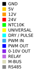
The following wiring diagram shows the wiring for a basic HIU.

