HIU Monitoring and Controls Refurbishment
Graphics
Above is a live dashboard shows a twin plate HIU fitted with open-source monitoring (watch it and figures will change in real-time). If asked to login, use guest / guest.
This dashboard can be applied to any make of HIU where it is possible to extract data, either through wired connection or through the use of additional sensors.
This form of dashboard uses colours and text to give an 'at-a-glance' feeling for all temperatures and current operation. It includes sensor readings, settings read from the HIU, and daily statistics, while also providing access to graphs.
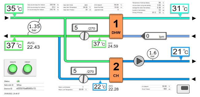
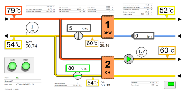
The two screenshots below show two systems in properties side by side. The one on the left is using compensated heating functions, and the one on the right is running a set central heating temperature. These HIUs are part of a field trial to understand the limits of return temperature performance that can be achieved with some more advanced HIU functionality. The key difference can be seen in the VWART (average return) figures on central heating of 22.26C and 53.08C respectively. Both systems are fitted with the same radiator systems, unbalanced with a 10C drop.
These systems can be seen running side by side live on the Dual HIU dashboard example.
All graphics using in software is based on the SVG standard file format. This allows compatibility with all browsers, and allows individual elements to be manipulated through code.
Inkscape is a free software package available for all computer platforms that is used to create and edit SVG files. It is one of the most useful programs of all time, with the ability to open PDF documents and then save them as web SVG graphics. This way output from any software package can be printed to PDF, and then via Inkscape be converted to an SVG file and edited or manipulated.
Graphs
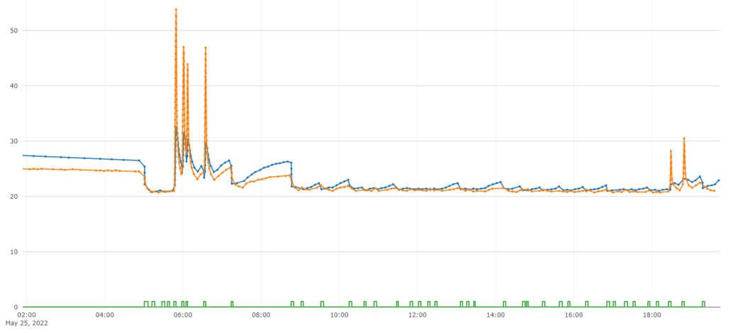
Graphs are the other vital tool used in diagnostics, providing historical data that lets us understand events. The graph below shows central heating flow are return temperatures as well as room thermostat calls, from the system above with compensation. It allows us to analyse how the central heating is operating, and how often the room thermostat is calling. Once can see that in the morning, temperatures went up to over 50C, but as the room thermostat slows down its calls, the HIU drops supply temperatures to compensate. By mid-morning the system has settled into maintaining central heating with very little temperature input (it is a warm day). This is a rare graph as hot water use usually prevents temperatures from settling so low, but it provides the perfect example of how the real world performance of systems can be optimised remotely.
Currently we use Plotly.js for graphing.
Device Panels
There are numerous ways to present summaries of devices, each suited to different tasks.
One of the most useful is a compact traffic light summary of devices (HIUs) showing their status. This allows hundreds of devices to be viewed at a glance.
Shown below is an embedded device panel showing the live status of HIUs in the field.
Device panels can be customised to show the preferred system identification, which would normally be the plot number or address.
Icons can be shown within elements to indicate current mode of operation, if a tap is running, or if heating is on. In this panel we are showing additional indicators regarding heat meters and HIU firmware.
Data Tables
The following table is an embedded MQTT Data Table. It is a web page that subscribes to MQTT data and shows incoming messages in a table format.
Data in the table is updated in real-time as it lands on the server.
This type of report uses MQTT security to subscribe to data, and can be sent to someone as a stand-alone html file, that whenever opened will log onto the server and start displaying data.


